
Guides
How to animate an SVG mascot
A mascot that moves feels alive: it floats while it waits, hops when you win and cheers when you get it right. This guide animates Pip, a fox cub made in SVG Mascot, with a few lines of CSS. Every demo below is the real file running the exact code printed under it.
- Live demos on real files
- Copy-paste CSS
- Still for reduced motion
Free to try with watermarked previews · Plans from $19/month · Cancel anytime
Base
What you can animate in a traced SVG
SVG Mascot exports still files: SVG, PNG and WebP, one per pose. It does not animate them. They are traced artwork, too, so a file is one flat list of filled shapes. pip.svg is 92 paths with no groups, ids or class names: nothing marks which shapes are the left arm or the eyes.
So this guide sticks to what works on a whole figure: moving, squashing, tilting and fading it, and swapping one pose for another. Moving a single arm or syncing a mouth to speech needs the character split into parts first; that is covered under Beyond CSS below.
The vector mascot guide shows a six-line bounce. Here are five fuller patterns, each one the real Pip running the CSS under it. If your device asks for reduced motion, every demo stands still and says so; the CSS for that is part of each sample.
Idle float: a mascot that waits
For an empty state or a loading screen. A slow ease-in-out drift of a few pixels reads as breathing; anything faster or bigger reads as bouncing.
Motion is off: your device asks for reduced motion
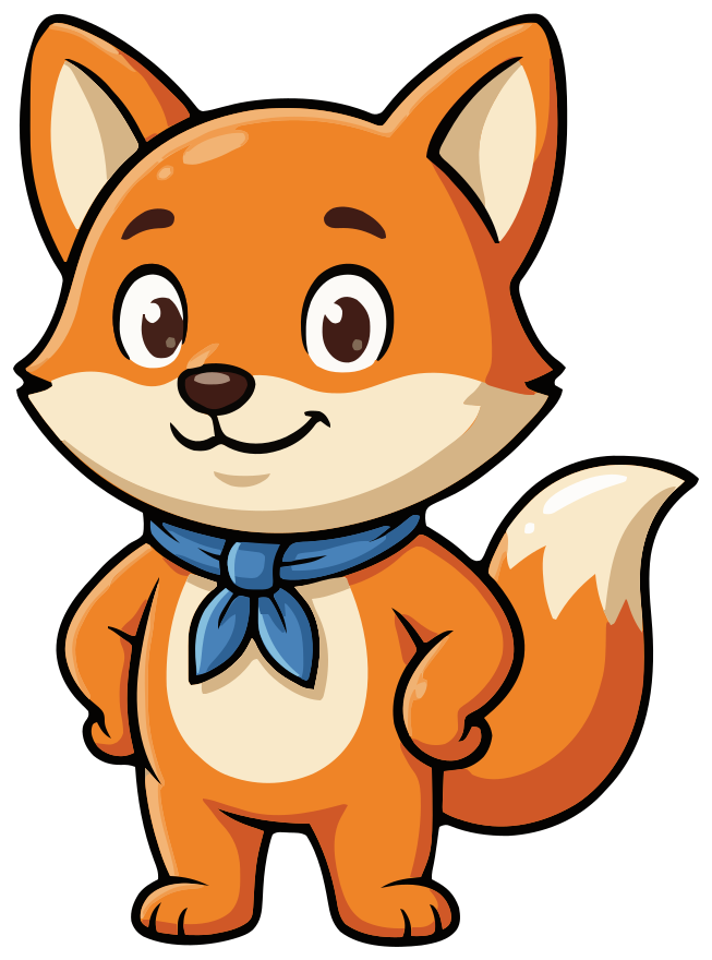
<img class="pip-float" src="/mascots/pip.svg" alt="Pip, a round orange fox cub mascot with big brown eyes and a blue scarf, paws on hips, smiling" width="160" height="216">.pip-float {
animation: pip-float 3s ease-in-out infinite;
}
@keyframes pip-float {
0%, 100% { transform: translateY(0); }
50% { transform: translateY(-8px); }
}
@media (prefers-reduced-motion: reduce) {
.pip-float { animation: none; }
}Squash and stretch: a hop with weight
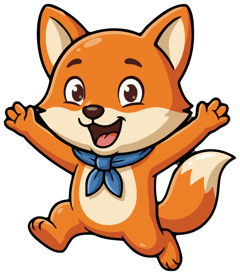
A plain bounce slides up and down. Squash and stretch, a classic principle of cartoon animation, makes it feel like a body: the mascot crouches (wider, shorter), stretches as it rises (narrower, taller) and squashes again on landing. Setting transform-origin to the bottom keeps the feet on the ground while it scales.
Motion is off: your device asks for reduced motion
<img class="pip-hop" src="/mascots/pip-cheer.svg" alt="Pip the fox cub jumping with both paws in the air and his mouth open, cheering" width="160" height="183">.pip-hop {
transform-origin: 50% 100%;
animation: pip-hop 1.2s ease-in-out infinite;
}
@keyframes pip-hop {
0%, 100% { transform: translateY(0) scale(1, 1); }
15% { transform: translateY(0) scale(1.08, 0.9); }
40% { transform: translateY(-18%) scale(0.94, 1.08); }
60% { transform: translateY(-18%) scale(1, 1); }
80% { transform: translateY(0) scale(1.06, 0.94); }
}
@media (prefers-reduced-motion: reduce) {
.pip-hop { animation: none; }
}Wiggle: a nudge for a notification
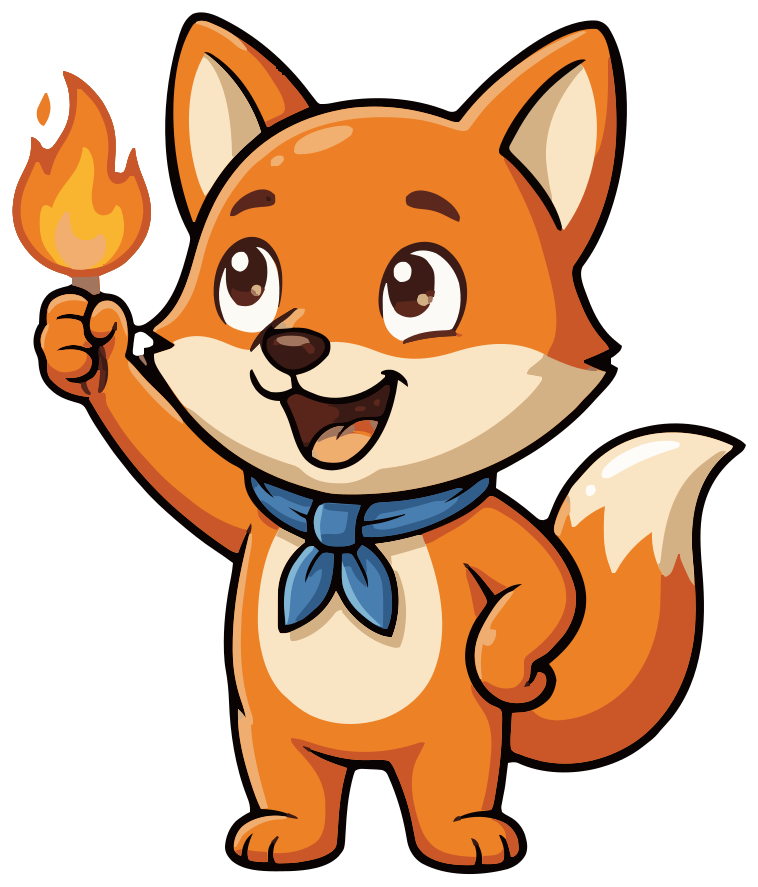
To pull the eye to a reminder, tilt the mascot a few degrees each way, a few times, then stop. It runs three times and rests; a wiggle that never stops becomes noise people learn to ignore. Add the class when the notification arrives.
Motion is off: your device asks for reduced motion
<img class="pip-wiggle" src="/mascots/pip-streak.svg" alt="Pip the fox cub holding a small flame up like a torch, mouth open in an excited grin" width="160" height="187">.pip-wiggle {
transform-origin: 50% 90%;
animation: pip-wiggle 0.5s ease-in-out 3;
}
@keyframes pip-wiggle {
0%, 100% { transform: rotate(0deg); }
25% { transform: rotate(-6deg); }
75% { transform: rotate(6deg); }
}
@media (prefers-reduced-motion: reduce) {
.pip-wiggle { animation: none; }
}Entrance: a hello for onboarding
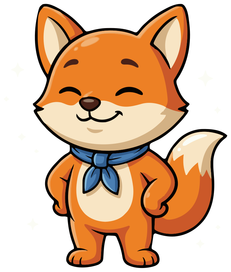
The first time the mascot appears, fade it in while it grows from 80% to full size. The cubic-bezier easing overshoots slightly, so it lands with a small pop. It plays once, and the both fill mode keeps it hidden before it starts and visible after.
Motion is off: your device asks for reduced motion
<img class="pip-enter" src="/mascots/pip-proud.svg" alt="Pip the fox cub standing tall with paws on hips, eyes closed and a proud smile, faint sparkles around him" width="160" height="189">.pip-enter {
animation: pip-enter 0.6s cubic-bezier(0.34, 1.56, 0.64, 1) both;
}
@keyframes pip-enter {
from { opacity: 0; transform: scale(0.8); }
to { opacity: 1; transform: scale(1); }
}
@media (prefers-reduced-motion: reduce) {
.pip-enter { animation: none; }
}Pose swap: thinking, then cheering
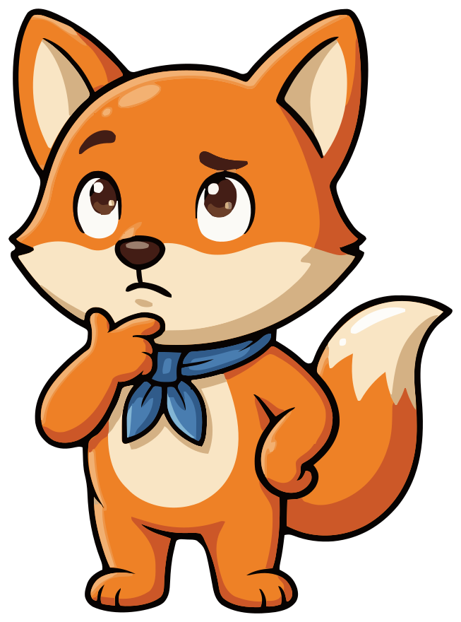
Each pose is its own drawing, with its own shapes in its own order, so you cannot morph one into the other. Stack two poses in the same spot and crossfade: the thinking Pip fades out while the cheering one fades in, as a quiz would on a right answer. A few lines of JavaScript toggle a class; CSS does the rest.
Motion is off: your device asks for reduced motion
<div class="pose-swap">
  <img class="pose-before" src="/mascots/pip-think.svg" alt="Pip the fox cub with a paw on his chin, one eyebrow raised and eyes looking up, thinking" width="160" height="216">
  <img class="pose-after" src="/mascots/pip-cheer.svg" alt="Pip the fox cub jumping with both paws in the air and his mouth open, cheering" width="160" height="183" aria-hidden="true">
</div>
<button type="button" class="pose-swap-button" aria-pressed="false">Answer correct</button>
.pose-swap {
display: grid;
place-items: center;
}
.pose-swap img {
grid-area: 1 / 1;
transition: opacity 0.4s ease, transform 0.4s ease;
}
.pose-swap .pose-after,
.pose-swap.is-cheering .pose-before {
opacity: 0;
transform: scale(0.95);
}
.pose-swap.is-cheering .pose-after {
opacity: 1;
transform: scale(1);
}
@media (prefers-reduced-motion: reduce) {
.pose-swap img { transition: none; }
}const stage = document.querySelector(".pose-swap");
const button = document.querySelector(".pose-swap-button");
const [thinking, cheering] = stage.querySelectorAll("img");
button.addEventListener("click", () => {
const on = stage.classList.toggle("is-cheering");
button.setAttribute("aria-pressed", String(on));
thinking.setAttribute("aria-hidden", String(on));
cheering.setAttribute("aria-hidden", String(!on));
});img, inline SVG or object: what CSS can reach
How you put the SVG on the page decides what your CSS can touch.
- An <img> tag is one box. Your page's CSS can move, scale, rotate and fade it as a whole, which is all the demos above need, but it cannot reach inside the file. This is the simplest and most cacheable choice.
- Inline SVG, the file's <svg> markup pasted into your HTML, puts every path in your page, so CSS can target single shapes. In our files the paths have no names, so you select them by attribute, such as their fill color.
- An <object> tag loads the SVG as a separate document. Your page's CSS does not reach into it; a script can, through the object's contentDocument, when the file is served from your own site.
Recolor on hover with inline SVG
With the SVG inline, a CSS rule beats the fill attribute written on a path, so you can recolor shapes without editing the file. Pip's blue scarf is seven fill values across 16 paths: four blues and three light blues on its edges, because traced art splits one color into close shades. This turns the scarf pink while the pointer is over Pip:
.pip:hover path[fill="#2E6295"],
.pip:hover path[fill="#4882B8"],
.pip:hover path[fill="#4882B9"],
.pip:hover path[fill="#4983BA"] { fill: #C2185B; }
.pip:hover path[fill="#80BADC"],
.pip:hover path[fill="#83BDDE"],
.pip:hover path[fill="#84BEDE"] { fill: #F48FB1; }
Put class="pip" on the <svg> element. Write the hex codes exactly as they appear in the file. If you want the scarf to follow your theme instead, edit the file once: replace those fills with fill="currentColor" and the scarf takes the CSS color of the <svg>. Neither works through an <img> tag.
Keep it smooth: performance
- Animate transform and opacity. Browsers can usually move, scale and fade an element without redrawing it. Animating width, top or margin makes the page lay out again on every frame.
- Animate the whole image, not its paths. A mascot is dozens of detailed shapes, and changing them one by one is far more work for the browser than moving one box.
- Use will-change sparingly. It asks the browser to prepare an element for animation and costs memory. Add it to one element that animates constantly, not to everything.
- Stop what nobody sees. A one-off like the wiggle ends on its own; for a loop, consider a set number of runs instead of infinite.
Make it accessible
- Honor prefers-reduced-motion. Some people get dizzy or sick from motion on screen and ask their device for less. Every sample above ends with a media query that turns its animation off.
- Never flash. Content that flashes more than three times in one second can trigger seizures, and the accessibility guidelines (WCAG) forbid it. None of these patterns flash; keep it that way if you add color changes.
- Let people stop loops. WCAG asks that motion which starts on its own, lasts more than five seconds and sits beside other content can be paused, stopped or hidden. That is why the looping demos here have a Pause button.
- Keep the meaning in text. A cheering mascot is decoration next to a message like Correct!, not a replacement for it. Give the image a short alt, or an empty one if the text already says it all.
Beyond CSS: SMIL, the Web Animations API, Lottie and Rive
SMIL, the animation tags written inside an SVG file such as <animateTransform>, works in current browsers. It is rarely the right choice for a mascot: the motion lives inside the file, so you edit the file to change it, and you have to handle reduced motion in there too.
The Web Animations API is CSS keyframes from JavaScript. element.animate() takes keyframes and timing and returns an Animation you can pause, reverse or cancel, which helps when the motion depends on app state. This plays the wiggle once when a notification arrives:
const pip = document.querySelector(".pip");
const reduce = matchMedia("(prefers-reduced-motion: reduce)").matches;

if (!reduce) {
  pip.animate(
    [
      { transform: "rotate(0deg)" },
      { transform: "rotate(-6deg)" },
      { transform: "rotate(6deg)" },
      { transform: "rotate(0deg)" },
    ],
    { duration: 500, easing: "ease-in-out", iterations: 3 }
  );
}
Lottie and Rive are for a rigged character: an arm that waves on its own, blinking eyes, a mouth that talks. Both need the mascot split into named parts first. Open the SVG in a vector editor, group its paths into head, body, each arm and the tail on their own layers, and fill in what is hidden behind an arm. Then animate those parts in a tool that exports Lottie, or in Rive. Our files are not rigged and do not arrive in parts, so this step is yours, or an animator's.
In an iOS app: SwiftUI
Add the SVG to your asset catalog (Xcode accepts SVG there), then float it with offset and a repeating animation. SwiftUI reports the Reduce Motion setting in the environment, so the float only starts when it is off:
struct FloatingPip: View {
    @Environment(\.accessibilityReduceMotion) private var reduceMotion
    @State private var up = false

    var body: some View {
        Image("pip")
            .resizable()
            .scaledToFit()
            .frame(width: 160)
            .offset(y: up ? -8 : 0)
            .accessibilityLabel("Pip the fox cub")
            .onAppear {
                guard !reduceMotion else { return }
                withAnimation(.easeInOut(duration: 1.5).repeatForever(autoreverses: true)) {
                    up = true
                }
            }
    }
}
repeatForever with autoreverses runs the change there and back for as long as the view exists: 1.5 seconds up, 1.5 down, the same three-second cycle as the CSS float.
In an Android app: Jetpack Compose
Import the SVG as a vector drawable with Android Studio's Vector Asset tool, then drive the offset with an infinite transition:
@Composable
fun FloatingPip() {
    val transition = rememberInfiniteTransition(label = "float")
    val offsetY by transition.animateFloat(
        initialValue = 0f,
        targetValue = -8f,
        animationSpec = infiniteRepeatable(
            animation = tween(1500, easing = FastOutSlowInEasing),
            repeatMode = RepeatMode.Reverse
        ),
        label = "offsetY"
    )
    Image(
        painter = painterResource(R.drawable.pip),
        contentDescription = "Pip the fox cub",
        modifier = Modifier.size(160.dp).offset(y = offsetY.dp)
    )
}
An infinite transition starts as soon as it enters the composition and runs until it leaves, so put it only on screens where the mascot should move.
FAQ
Animating a mascot: questions
Can SVG Mascot export an animated mascot?
No. SVG Mascot exports still files: each pose as an SVG, a high-resolution PNG and a WebP. You animate them yourself, with CSS as on this page or in an animation tool. A set of poses of the same character makes pose swaps easy.
Can I animate just one arm or the eyes?
Not with the file as it comes. Our SVGs are traced artwork: a flat list of shapes with no groups or names, and nothing drawn behind the arm. To move one part, split the mascot into parts in a vector editor and rig it in an animation tool. For simple moments, a second pose and a crossfade often does the job.
Can I make a Lottie animation from my SVG?
Yes, with work. Lottie files come from animation tools, so bring the SVG into one, separate the parts you want to move onto their own layers, animate them and export Lottie. The SVG gives you clean vector artwork to start from; the rigging and animation are up to you.
Does animating an SVG mascot slow down my page?
Not if you animate transform and opacity on the whole image, as every demo here does; browsers handle that well. It gets expensive when you animate many paths of an inline SVG one by one, or properties like width and top that make the page lay out again.
How do I respect reduced motion?
Wrap the animation in a prefers-reduced-motion media query and turn it off when the visitor has asked for reduced motion, as at the end of each CSS sample above. In SwiftUI, read accessibilityReduceMotion from the environment. Keep the mascot visible, just still.
Can I try this with my own mascot for free?
You can create one for free: the free plan gives you 3 drafts, 3 variations and 1 base mascot as watermarked previews. Downloading the SVG, PNG and WebP to animate needs a paid plan, including for mascots you made for free.
See plans and credit costs